How to obtain high-quality customers through corporate brochure and brochure des
- 155 views
- By Rani Jarkas
- 2024-03-15 15:49:50
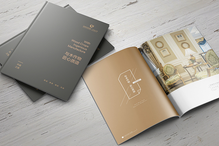
If you want to obtain high-quality customers, you must first make the brochures exquisite and high-end. If the brochures are uneven, then customers will feel that the company is cheap and will not think that the company can provide What are good services and good products, so we need to grasp the high quality of brochure design.
Fully consider the needs of customers. The form and distribution of brochure design should reflect the wishes of the audience. Even designs that look like traditional paper brochures can be transformed digitally with the interactive features of the PDF format. If you need to distribute a brochure to your audience, consider a size and format that will fit easily in a pocket or bag.
Finally, for stakeholders or key partners, a thicker or tougher, multi-page or larger size may be more appropriate. Then there are the design requirements for fonts: readability and enhanced visual effects.
1. Starting from the theme content, choose a font that is consistent in form or symbolic meaning with the content conveyed. The title or suggestive words can be determined according to the situation, and the style of the internal and external words should be unified.
2. Easy to identify and read. When changing the font shape and structure, using special effects, or choosing calligraphy or handwriting, we should pay more attention to its recognition.
3. The arrangement should conform to people’s reading habits. For example, don’t have too many words per line, and choose appropriate word spacing and line spacing. You can also create new layout effects with different font layout styles.
Next is choosing high-quality paper. Trust me, the quality of paper you choose can impact how successfully your design and message are received by your users. Additionally, it can influence the technology used in the design process. As a rule of thumb, thicker paper offers more flexibility in the use of color and printing techniques. At the same time, this paper quality can make it feel more expensive and impress users. But that doesn’t necessarily mean thicker paper is better.
Sometimes you may need a lower thickness or quality, especially if high volume is high or you need to distribute on a large scale to a wide audience.
Finally, the layout design:
1. The layout features are eye-catching, and the colors and images should be prominent and clear; the text can be appropriately larger.
2. Pay attention to the application of grid structure; emphasize the changing relationship of rhythm and maintain a certain blank; the relationship between colors must be coordinated and unified.
3. Find the common factors in the entire volume, set some standards or share images, and rank these main factors before designing other factors.
4. Grasp several key points in the entire volume and use points to control the overall layout.
5. The appearance should be generous and beautiful, making people feel good.
Leave a Comment